
Mimaki

UI/UX Design, Web Design, Information Architecture, Art Direction
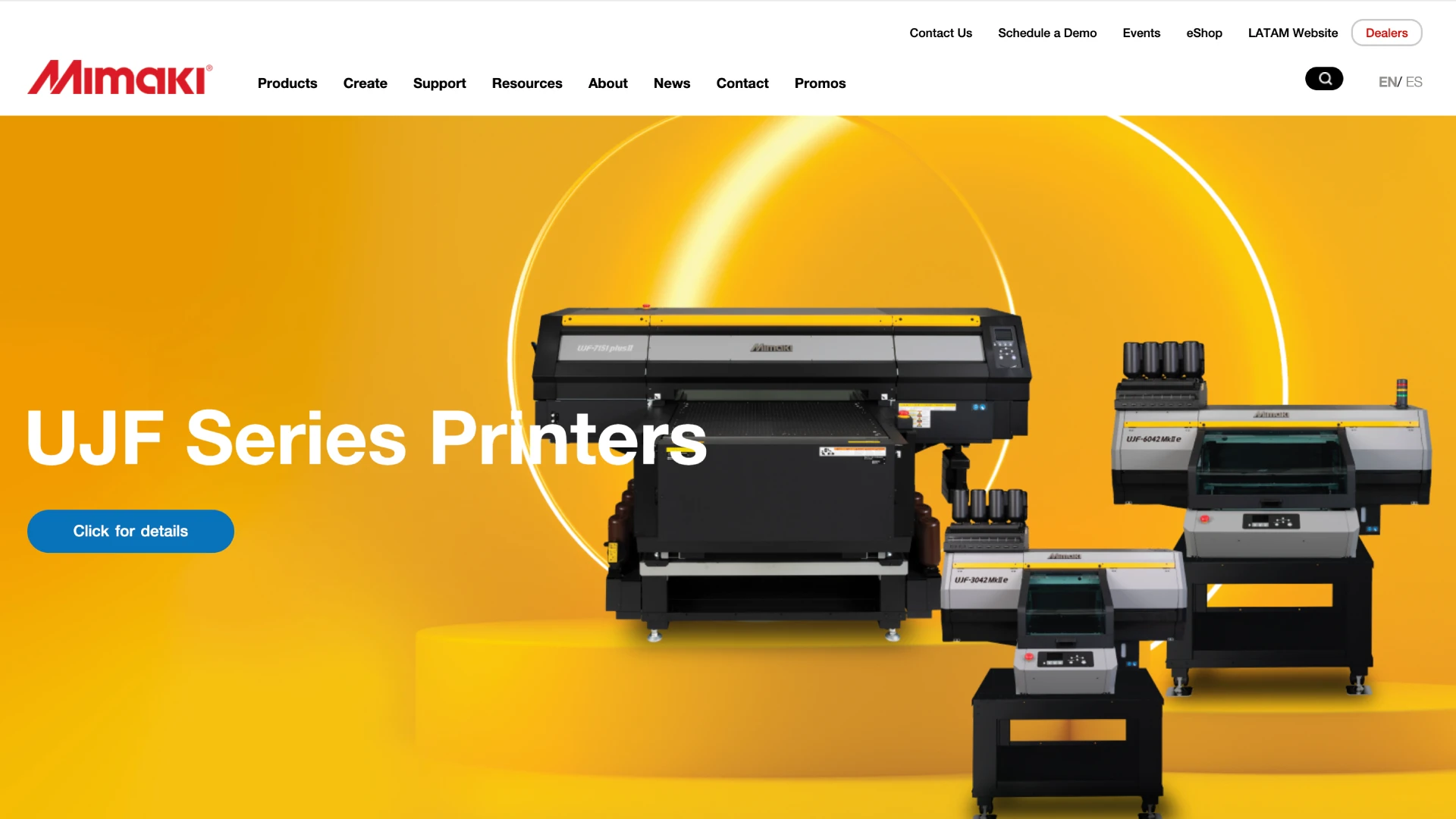
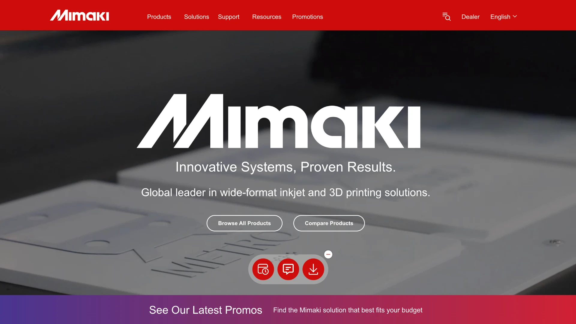
Mimaki USA is a global leader in wide-format inkjet and 3D printing. Their previous site carried an extensive catalog of printers, cutters, inks and software, but dense technical content and a legacy structure made it hard for buyers and dealers to find the right machine.
The redesign modernizes the visual hierarchy, simplifies the pathways into each product family and elevates the brand's credibility, with a bold red system built around the Mimaki wordmark.
information architecture
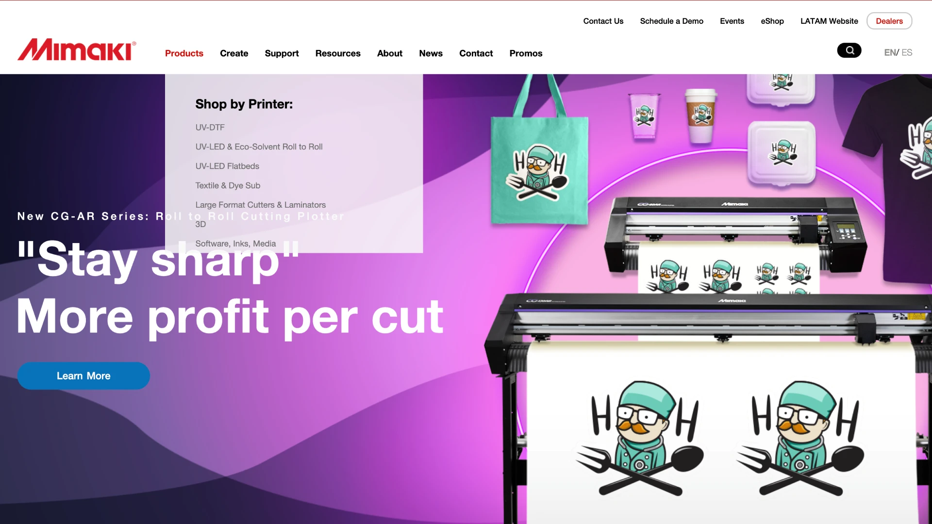
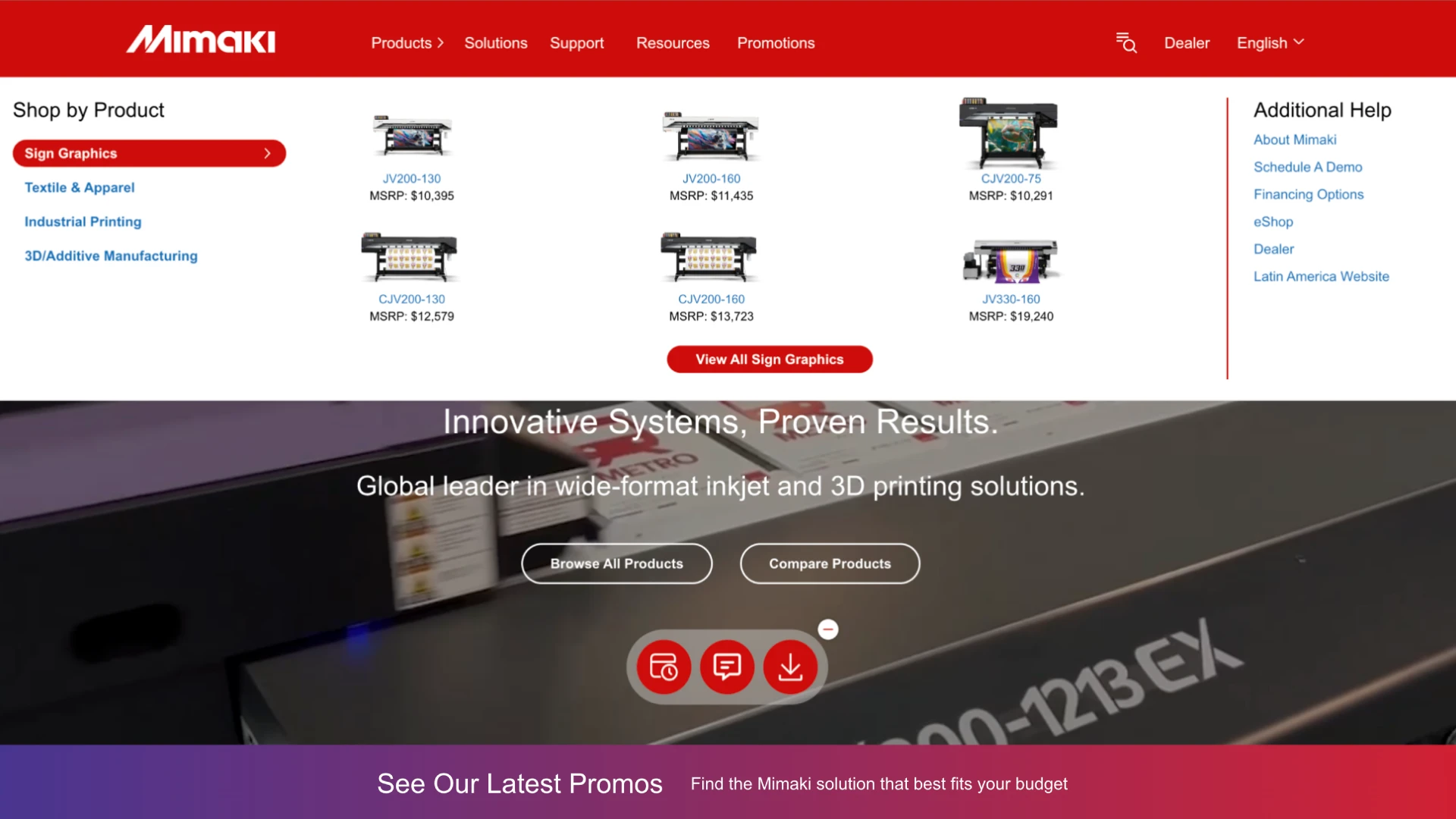
The old navigation spread eight top-level menus and a utility bar across two rows. We consolidated it into five clear paths and a visual mega-menu, allowing buyers to shop by product family, compare models, and see pricing at a glance, all with the ability to search within close reach.
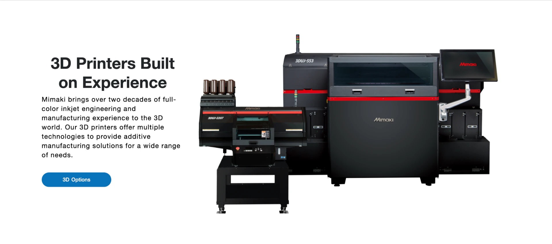
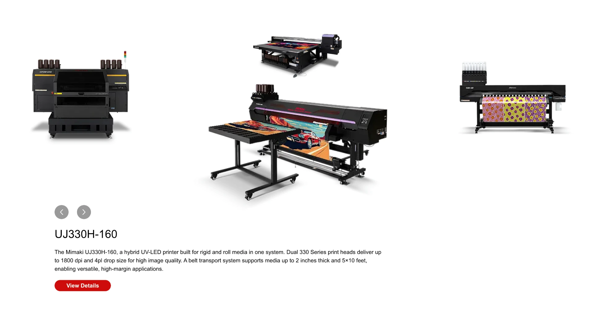
Product Showcase
The Featured Printer section now shows 4 highlighted products instead of just one. The interactive rotating carousel gives not only the product description but also the direct button for the user to go directly to more information.
Results
A cleaner, faster and more confident Mimaki USA: a site that matches the precision of the machines it sells, and makes it easier for every audience to find the right solution.