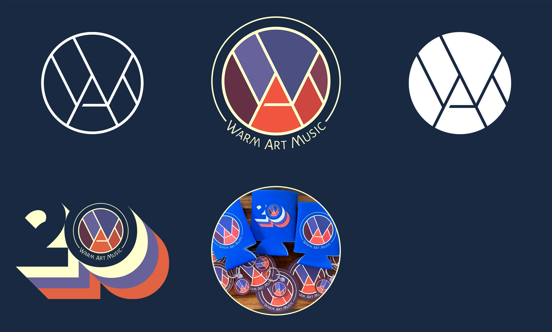
With over 20 years in the music game, Warm Art is an Atlanta staple. This logo redesign in 2018 introduced clever line play showcasing the W, A, and M letters. I drew inspiration from the mountains having just moved to Colorado and those letters fit into a modern landscape motif. Have a listen; you might see a familiar name.
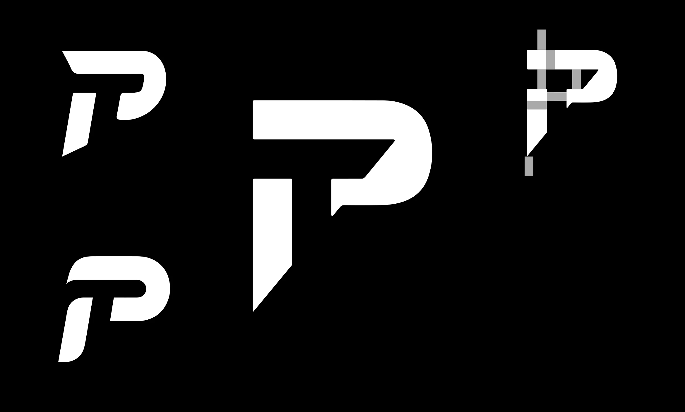
A new logo for an old friend, whose initials are "PT". I initially presented 3 concepts with the one shown in the center winning out. The use of negative space allows the T to be seen without using its own letter. The gray lines in the upper right show the even spacing between the elements.

The first piece in a full branding package that I was the lead on at Airtight Design. Check out the other details here, which included a marketing website.
